CU Color

OFFICIAL COLORS OF CONCORD UNIVERSITY
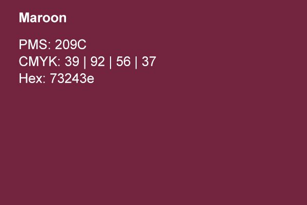
It is important to maintain the consistency of our color branding. The burgundy and gray of Concord University are recognized within the higher-education community almost as instantly as our logo. Below are our Primary, Secondary, and Tertiary color palettes.
The Secondary and Tertiary colors are meant to be used as subtle accents, intended to balance our imagery and promote a rich experience. These should only be used separately from our primary university colors. The proportion of use is very important, with a target of 10% usage of secondary and tertiary colors where the primary palette makes up most of the design.
In print orders, Spot color should be requested whenever technology and budget permit. In other circumstances, CMYK equivalents provided by the printer should be proofed against standard PMS color chips.
When purchasing materials, products or other marketing elements for the university, every effort should be made to match the primary PMS colors. Furthermore, any time the Concord University brand appears on the web, the equivalent RGB (or Hex#) should be used. This includes the official concord.edu website, all social media, blogs, YouTube videos, and any new media that displays only on screens.

